
6 Color Trends in 2022 to guide you in selecting the perfect palette for you!
Out with the old and in with the new!
6 Popular Paint Color Trends in 2022 to guide you in selecting the perfect palette for your home!
A new year is on the horizon and with it comes a new outlook and an opportunity for a fresh approach or at least a fresh coat of paint!
It's no surprise that the color trends for 2022 reflect a need for our spaces to feel cozier and more comforting. Natural color palettes remain essential.
In addition to the inspiration coming from the natural world with vivid greens and brown tones we also look to jewel tones and deep hues and some electric accents.
Come discover the perfect palette for you in 2022!
Warm Neutrals


An all natural and eclectic mix of pure and humble colors evokes the warmth and harmony of a more innocent age while celebrating life today.
Calming neutral earthy palettes ground us. They connect us and bring us home while not over stimulating.
Move over grey, warm earthy tones are overtaking cool neutrals. Adding instant warmth shades like terracotta, bold ochres and even beige do reflect that want to make our homes feel more comforting and inviting.
Earthy colors which bring the outside in are having a moment again. They help us feel healthy and serene. Look to classic neutrals which provide reassurance. Just make sure to stop them from being overly heavy and draining shades by livening them up with pops of color and hints of bright optimism.
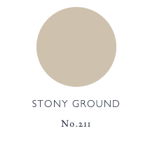
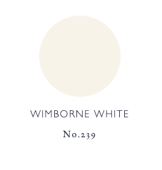
For reliable neutrals I love Farrow and Ball Eco-Friendly Paints.
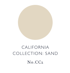
Stony Ground, Wimborne White, and Sand are a few favorite warm neutrals that can add grounding warmth to your home!
The shades of the 70s will play a key role in the color trends for next year, with the earthy terracotta tones that have been on trend for the last couple of years complimented by classic 70s palettes including rich brown and caramel colors, as well as bolder pops of pink and orange.

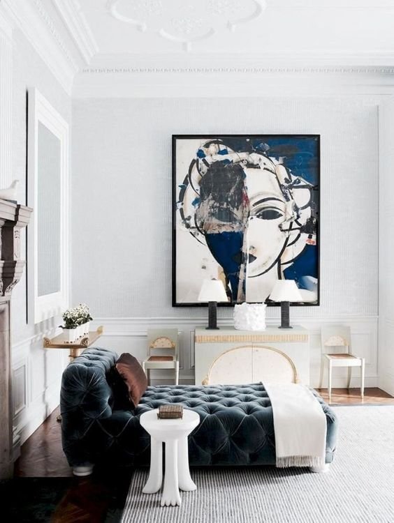
Burgundy
Burgundy, Bordeaux, and Merlot. Just like a glass of the above it can set the mood.

Burgundy
Derived from the famous Burgundy wine region of France.

Rich Jewel tones are another paint trend for 2022. Sophistication, Class, and Heritage can all be associated with these rich and regal colors.
There is a key difference between Burgundy and Maroon. Maroon is a mix of red and brown, while burgundy is a mix of red and purple.
This makes burgundy slightly brighter in appearance than maroon and gives it more of a purplish tinge.
Burgundy is often associated with higher class society. It’s rich hue and red shade are interpreted as signifying sophistication. It is seen as more serious than lighter shades of red and lacks a sense of fun, light energy that shades like pink have.
Burgundy can be viewed as a color indicating power. The combination of it’s psychological seriousness and powerful energy give it a sense of high ambition. Therefore, people who are trying to display their power or wealthy class may use burgundy as a way to show these traits.
Greens

From a color psychology standpoint, green is the color of nature, revitalization and growth.
It is symbolic of newness and signals growth, health, emergence and new beginnings.
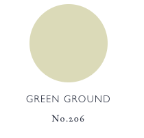
The refreshing Green Ground by Farrow and Ball has a calming feel, so it is well suited to use in kitchens to create a contented family atmosphere.
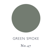
Often paired with a bright white to enhance its colour, it can also be used on panelling with the darker Green Smoke to create a reassuringly historic look that seems as if it’s always belonged.
A smoky green blue, this colour was popular in interiors during the late 19th century. It has an irresistibly inviting deepness and weathered familiarity when used in exterior situations, while evoking calm and serenity when used inside.
ViviStone Abalone Onyx by Forms + Surfaces features green and amber crystalline formations which add a natural feel and a distinctive look to any space.

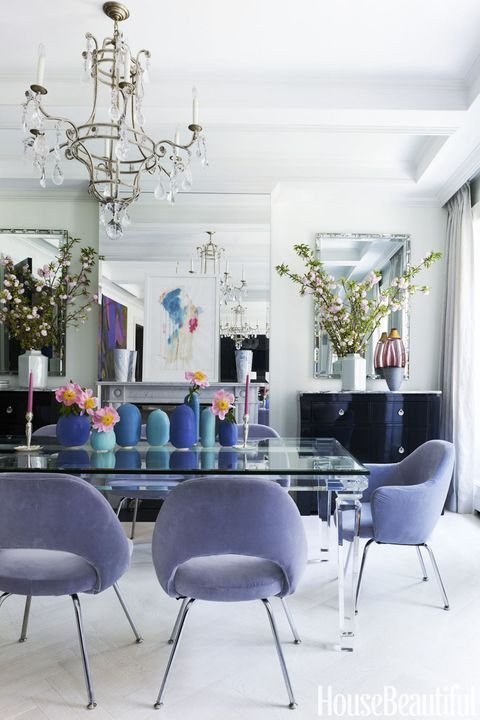
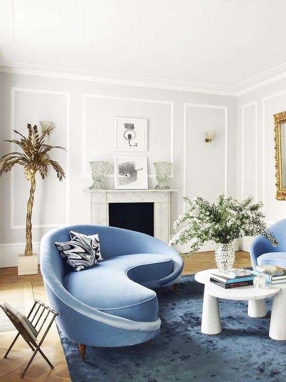
Hues of Blue
There is nothing more revitalising than a dive into the deep blue seas. Cleansing and purifying the ocean heals and replenishes. And who wouldn’t want to add the therapeutic powers of the ocean into their home?
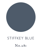
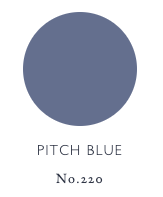
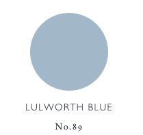
Stiffkey Blue, Pitch Blue and Lulworth Blue are a few Farrow and Ball blues that soothe.
Stiffkey Blue is an inky navy blue named after the Norfolk beach where the mud, along with the cockles, share a particular deep navy hue. Although traditional in feel, Stiffkey Blue is often used to create a richly dramatic space with a more contemporary finish. When used in well lit areas of the home it will appear much bluer, working wonderfully when contrasted with Ammonite.
Lulworth Blue is a fresh mid blue whose name comes from the shade of the sea at beautiful Lulworth Cove, Dorset. Typical of a formal Regency hue, Lulworth Blue sits happily alongside similarly clean Wimborne White and Parma Gray. Despite its brightness, it can promote deep and peaceful sleep when used in low lit rooms, especially when used on both walls and woodwork.
When it comes to using blues in your interior our only advice is Dive in Deep!
Electric Yellow
Feel good Vibes! We all want to feel grounded and good, while feeling hopeful and optimistic, therefore, some exciting punches of color will start to shine through.

Influences from the 80s are set to be a big trend in 2022. Yellow paint is just like adding a drop of sunshine to an interior space adding a brightness and inner glow so why not put a splash of this bold and bright hue in your space.

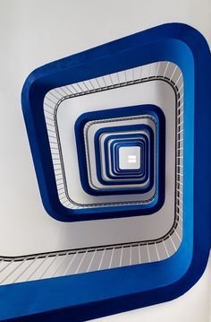
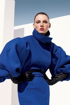
Cobalt Blue

Nature loves blue!
From the sea to the sky and it’s ever changing hues, tones, and values, it’s no wonder we can’t get enough of this color.
Cobalt is a sedating color which reduces physical energy, like regular blue it can also lower or suppress emotional energy.
Similar to indigo, it’s a deep color which promotes deep thinking and intuition. Cobalt also helps with concentration and creative thinking.
Cobalt is a particularly popular shade of blue, once referred to as a divine color by Vincent Van Gogh. This would be the perfect color choice for a person that is sensitive to aesthetics, that picks up on subtle differences, and those differences are important to them. This would be a person that appreciates art and beauty, likely favors abstract art.
It would also likely suggest a person that was very in tune with their intuitive side, often relying on their sixth sense, seeing patterns and making connections between things.
For more color trends in the new year, Benjamin Moore produced their color trends palette of 2022
Our best advice for choosing a palette that reflects your individual style and how you yearn to feel is to follow your feels and it’s ok to mix it up!
May your new year be filled with comfort, security, peace and prosperity!